Pages

Proposed Work - My Website


I apologize for the brevity of the video.

I just titled the piece as "keidesigns.com" as it's a website for my design company and in order to display my work for the project. As there is not real concept to it, as it's a design based assignment for my own company, there is not visual meaning or symbolism to it. I really just wanted to make it look clean and be easy to understand - the video above is to just explain how the site should work.

Using photoshop I think was ideal because it allowed me to edit the photos, and create the animations I wanted for the piece. It might've been nicer to create the background with illustrator, but I feel like it wouldn't have given as nice of a look in comparison to photoshop when merging it with my photographs and then taking it back to be animated - it just seemed like a lot of headache.

For photoediting, I had a lot of issues, simply because I am very bad at coloration, but with a lot of help from tutorials and from just pure perseverance I was able to attempt at it, and I am very pleased with it all. Another issue I face was while animating, I faced a lot of grievances just trying to get my layers in order and making sure everything matched up because a lot of repetition took place in those gifs, so I put in a lot of effort to making it work out and look as smoothly as possible - I feel like it worked out.

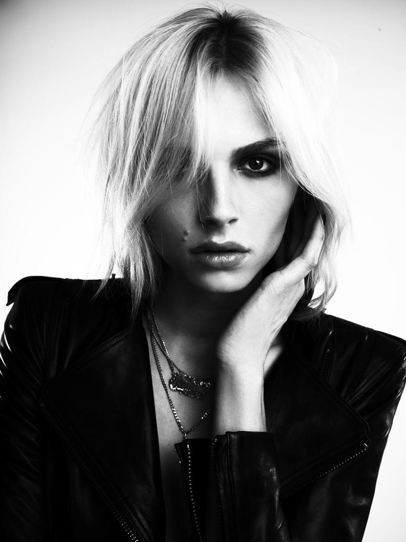
I started out with a few sketches, before going into making/planning the outfits for the photographs. Following that I went in and made my opening page and all the backgrounds for it, planning and placing the layout etc. I then took the pictures for my website and shot a video for the gif. However after taking it into the computer, the images were very dark and the gif was much to dark to be used, so I went through trying to find colorations that would increase the quality of my images - luckily I was able to do that, but my video wasn't salvageable.

Instead I took some of my test video from my personal gif and went forward to make a gif out of that and add coloration to it as well to add that little touch. After that was done, I had some stress placing all of it together in it's form - the gif wasn't exactly cooperative - but I got all of my images with the website base and animated all of it. I then rendered all of them in order to put them into after effects and "stitch it" together into one video.

The work was inspired by many of the fashion websites out there; black milk, dollkills, and especially the blanc & eclare company. All of the websites were inspiration for my website. Also the fact I needed to work on things similar to this for my portfolio for university also helped drive along this assignment.

Overall I'm pretty proud of this, I love the coloration and the ideas I hit with this. I wish I would've been able to do more with this, especially with the site design and make it more like my original idea but I am satisfied none the less. My biggest thing however, it that I wish I could've made video more paced... But I have no clue what I'm doing in aftereffects, so my attempt was at least there.

Portfolio

My portfolio can be found at: http://roxia96.wix.com/roxiaportfolio


Infographic


For my infographic I wanted to go with a very clean approach to the design, opting for it to be as simplistic as possible while keeping as much info as I can in the image.

So in order to do this I made the lines look like a subway line, having the current place - the beginning - be lit up with the name of the university to mark it. I tried to have all of the stuff line up and be even in order to make it look concise, having headers to help differentiate the areas and to help one read the infographic better.

The icons used I tried to make quite familiar, and easily understandable. I used a spool of thread since this is a fashion program based infographic to represent the pieces needed for portfolios. A paper for written and for a smaller amount of money I used a coin because having too many of the dollars bills, and also slicing them I feel wouldn't be as clean.

I wanted to have the comparison of distance since it was a noticeable difference for at least one of the schools, so I just used simple images to explain the difference. I had the years described with a clock to make things very simple, and then I went onto to work on the diplomas. I have the certificate listed and then additional things you can get at that school in writing just because I felt it worked best and that it was better than to add more pictures.

For my legend I decided rather than to box it in, I'd put it where it gradiates to white in order to separate it but not cut it off. I feel by doing that it looks a lot cleaner, which is the whole point of my infographic.

Visual Identity


So with my company "kei designs" we are a fashion design company that specializes in making clothing for females. We are called "kei" because it means style in Japanese, and because we take a large amount of our inspiration from Asia. We try to make varying degree of clothing types, we do not try to fit into a box of having very girly clothing to very "tough" clothing, instead we try to make our clothes fit into a very differing styles in order to suit everyone.

I wanted to make my company logo very word based as many fashion designers have their company logos, but as this assignment required a pictograph as well, I choose to add in a fan because I feel they are quite feminine as well as that Asian flair. My colors were a straight black for the words and a cream color for the rest, I really didn't want the fan to be overpowering and also I wanted there to be a lace effect to it, so I choose a cream color in order for it to stick out but not be all too noticeable. Also in terms of my logo, it fits properly against my wording and although it sticks out a bit the darker color makes the other side heavy so it balances.

For my additional pieces I choose a phone case because I feel like the phone case is something that will be easier purchased and everyone has a phone now a days so phone cases are in high demand, it's just something that is popular to purchase. With the keychain, it's a fashion design staple actually to have something like this. If you look at a lot of the fashion companies, they have their logos on keychain similar to this.


Independent Project

For my independent project I want to design a complete clothing line of clothes with an included a mockup of a website and photography of the items. So what I will be doing will be creating pieces - have someone model them and then photograph it. I will take those photographs and put them in the mockup of a website for this line I am creating. I will also be providing other items in this line - that I will not be creating - that have been drawn digitally.
The theme that I choose for this line was a circus theme because I felt like it was one with an open end and I could take many approaches with the concept. 


Animated Gif - Tarzan


For my Living Movie Still I choose Tarzan, by Disney and for it's quote I choose the "You were Always My Son" quote from the end of the movie. 

The movie is about acceptance despite differences and learning there is no barriers to family. The scene I have chosen is from the end of the movie after Kerchek dies and Tarzan is made king, all the gorillas acknowledging him as such; therefore accepting him as once of them despite being very different. 

Why I choose the "You were always my son" quote is because throughout the whole movie Kerchek - who says this quote - has refused to acknowledge Tarzan as his own children because he was different than them. However, at the end of the movie during his death, he accepts Tarzan as his child - which is what Tarzan always wanted - and subvertedly making him leader of the pack and king of the jungle.

"Consumerism" Photography Series


Theme I have chosen for my BW+1 photography series is "Consumerism" but rather than using the general idea of consumerism - which is shopping - I wanted to look at consumerism as something that consumes someone - something that consumes your thoughts and feelings etc.
Artistic Question Uno:  How can I express the theme Black and White + One through photo-based artwork?
  • To represent the theme of Black and White + One through my idea of Consumerism is the idea of black and white being the surface of a person i.e. what one can see at a glance. For the "+ one" I wanted to represent that by having their makeup done in a way to represent the "consuming aspect" and/or photoshop overtop  of the person and have that represent what is consuming you, it would be like adding color to the black and white to create more depth - so going past the surface. (for examples of how the makeup would work is reference two and three)
Artistic Question Dos: How can I explore using the medium of photography in a way that stretches my current knowledge and understanding AND suits my interpretation of the theme?
  • To stretch my knowledge in the medium of photography I will be using a mix of fashion photography - which is defined by having the subject's style (clothing, makeup etc.) emphasized as well as the idea of using a non-realistic setting for it rather than casual surroundings, also it requires a controlled lighting situation. I will also be using some elements from portrait photography - mostly the technique of butterfly lighting. (reference one for the style)