Pages

Thaumatrope

A thaumatrope of a dog and birds
The layout of Laura Hayes and John Howard Wileman Exhibit of Optical Toys's site is a little boring, there's nothing really interesting about it, it's a plain white and black, with a center alignment, it's not very intriguing. The actual content of this site is quite thorough and well written, they have a lot of information on the actual toys, along with pictures, videos and how to make the actual toy (if possible).
My favorite toy from the site would have to be the the Thamuatrope.  It's a small disk that has two holes on either side and have string strung on them, two images are drawn on both sides, both made to complete each other in a full picture. To get the toy to work, you have to hold one string and turn the disk, then you hold the disks and gently pull, causing it to wind and unwind, the faster you can get it to spin, the better the full image appears.
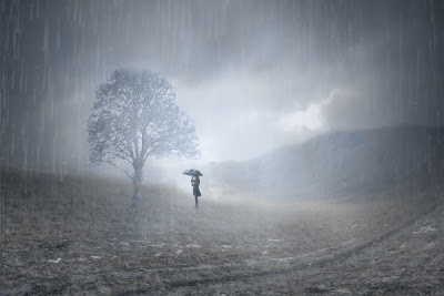
Photoshop Test

'Stand In The Rain'
This is an image I made in photoshop, it's of a lone figure, standing in the rain next to a tree, all pictures were acquired off of the internet. To create a picture similar to this, you would first need to find a field or barren land that has a clear skyline, then, using the warp tool, warp so it has a dip in it's right side. Afterwards find a picture of a mountain, then put it on a new layer over the field, from there align it with the dip so the mountains match up with the dip, but make it stretch so it reaches both sides. After aligning it, you warp it so it matches the dip you have on the field, then use the the masking tool to erase everything but the mountains and to have it blend with the field.
Now, find a cloudy sky and put that on a new layer, from there, mask it so it only covers the mountains and the sky, after that, change the opacity to 65%. Pulling up a new layer, get a picture of a tree and using the color range tool, select the sky so you can keep only the tree, you then use the hue and color balance tools, change it to an eerie blue color, shrink it down and mask it so it blends better with the picture, then change layer type to darken. Copy and paste your tree onto another layer - so you have two trees - and horizontal flip it, matching it up with the other tree, change the perspective and the size so it looks like a shadow of the tree. Then change the layer type to hard light and 46% opacity.
Using another new layer, using a scatter paintbrush, use a light blue and paint your image so it has multiple dots on it, then change the opacity to 72%.

'Falling Through the Cracks'

Chess Piece Drawing
Once again, I've made a chess piece drawing, this chess piece had the criteria of; making the chess piece realistic, using value and creating movement, rhythm and pattern, with the background.
I feel that the chess piece looks very realistic, though small, you are able to recognize it as a bishop and it looks quite real. The shading of the chess worked with the rest of the background, which had different values and was shaded properly. I created movement with the drawing by have a large, lightly shaded swirl that circled inwards, bringing your eye to the chess piece. Underneath that  swirl I had smaller, darker swirls, that go outward.
This piece is called 'Balancing' because I felt as if the chess piece was balancing on the two swirls, and was about to fall off. I'm quite pleased with the look of this drawing and realism of the chess piece.

Compostion Photos

This photo shows linear perspective and depth perception. Depth perception because there is a distance between the closet object to you and to the farthest object (i.e. the door). Linear perspective is shown by the straight angle of the photo.
This shows linear perspective by the football players being in a line, as well as the yard lines on the field. The yard lines also angle your eyes down, giving it depth perception. It's also a bit of an action shot, showing the players in movement.
As well as the other photo, this picture shows linear perspective as well as depth perception. Everything in this photo leads your eyes from the floor to the door.

Compostion Sites


This site shows you 10 of the most common composition rules, showing you examples and giving definitions of the rules and explaining how it effects the quality of your photo.


On this site, it shows you more of the elements of composition, except in more depth. It has a master list that shows pictures and gives you the beginning of the explanation of the rule, and then you can go to a more in-depth post.

Logo

Color and B/W version
In CyberARTS we were assigned to make a logo based off our name and it's meaning. From my name I came up with a bow with a flaming candle instead of an arrow, resting over a circle with my name over it.
The from the meanings of my name I got; magic, honesty and enlightenment, from there I narrowed it down to things that clicked with me and things that would be easy to  convert in to a logo. I searched more into my name and ended out choosing; candles, archers and radiance.
I came up with multiple ideas, basing my focal point on candles, archers and radiance.  From there I made thumbnails of bows and arrows, as well as candles, in the end I settled with the idea of a bow and with a flaming candle as the arrow.
For color I used a vibrant blue because it stood for wisdom, femininity and power, it radiates this candy apple red of sorts because not only did it look good with the blue, it balanced in out in  meaning, it's meaning being masculinity, calmness and strength. I used a mix of gritty and clean lines to show edge and stability. My name is jagged and drags out, they are meant to look edgy. I used a circle to show radiance, it going out from the candlelight.
Using the pen tool was best in this project, I used it for all parts - excluding my name and the circle - it was easier to create shape using it. Transferring the sketches to the computer was quite simple, trying a lot of different methods to go for the look I want.
I like my logo, the finished product is good to look at and clean. If I had a longer amount of time, I would have worked more on the name and tried to get it to tie in more with the design of my logo. You have to think about sizing when it comes to logos, how it will look on a smaller scale and  how it will look on a larger scale, trying to make it look similar and appealing in all sizes. Next in AI, I have started to work on making a b/w tracing of a photo of a band in honor of their concert I am attending.

Grid Drawing

Third Class Carriage - Daumier

Mona Lisa - Da Vinci

Crows and Cornfields

Van Gogh
If one were to base this picture off of imitation it would be a poor piece. Though things are recognizable it isn't exactly very realistic, the crows especially, since they are very cartoon-like and far from lifelike. Also the colors and the way it's painted also disillusioned the painting, the heavy paint strokes and the off coloring of the piece making it seem even less realistic.
With formalism this is a great piece. The dark blues of the sky along with the crows, balance out the brightly colored wheat and pale blues of the sky. The piece is intense, and unified, keeping your eye inside the painting and leading your eyes around, the composition of it is done well.
The feel of this painting is surreal. It's simple and whimsical, sparking a question of why he painted it. The dark and light of the sky keep the piece looking calm, and the bright yellow of the wheat give it energy. It's a well done piece emotionally.

Logo Analysis

Logotype
This logo is of Disney, it's directed towards a younger audience. The line type is very clean but also very playful, it say that the company is professional but also is anchored towards kids instead of an older generation. The color is black but changes depending on the merchandise it's on, it's made to fit everything. The logo does work for the company because it looks interesting and fun for the younger audiences.
Initials

Stop Motion Animation


This is a stop motion animation that, is based off of Alice In Wonderland. I found it interesting and I liked it a lot... Not to mention the girl is very pretty.
Darkhearts- 

Rhythm - Second time around

Line 1
For this repetition of lines, we were supposed to show rhythm using lines that went in one direction, varying in width, spacing or height. In this picture, I showed rhythm using thin lines that started up, curving at the top to resemble a flame - as these lines are to represent lit candles - it shows rhythm by repeating at an equal distance but varying in height. Your eyes are caught by the 'flames' and are brought down, continuing down the line of 'candles'.

Line 2
For this rhythm picture, we were allowed to go in any direction. I used thick lines going upwards on a slant, as well as thin slightly curved horizontal lines going across. First you look at the thick lines, bringing your eyes up the page as well as, side to side due the the horizontal lines.

Andy Warhol

Andy Warhol

Andy Warhol, a man born in the ghettos of Pittsburgh during the Great Depression who grew up to become one of the most amazing artists, commonly recognized by his 'Pop Art' paintings, Campbell Soup Cans and his crazy wigs.
Warhol wanted to become an artist since a young age, starting out using magazines his mother used to bring home for him when he was a bedridden child - he had chorea which explains the wigs and sunglasses Warhol liked to adorn - then becoming a young man moving to New York with only 200 dollars, making paintings for 12.50 and small commercial drawing. But he wanted more, and that he got.
It first started with the Coca Cola bottle and then to the Campbell soup cans, both of them inspired by the consumerisms of that day. Warhol soon became a hit. He ran parties in his studio known as 'The Factory', and it was a big hit, because if you wanted to be seen with anyone, it was Warhol.
Warhol is one of the most influential artists in the world and his art is worth more than thousands of the dollars. He has a museum dedicated to himself as well as a bridge in his home town of Pittsburgh. Just shows you how a person from the ghettos can become someone big.
DarkHearts- 

O.o

Oh my god... It's been months since I've been on here, I'm only making this post because I am bored and waiting for everyone in Year 1 to finish with their own blogs... I'm just sorta playing around.

But I'm happy to be back in CyberARTS!

Klaus Gnomi


In class we were able to make a stop motion animation using our thumbs and ink. This stop motion animation is of Klaus Gnomi