Pages

Animated Gif - Tarzan


For my Living Movie Still I choose Tarzan, by Disney and for it's quote I choose the "You were Always My Son" quote from the end of the movie. 

The movie is about acceptance despite differences and learning there is no barriers to family. The scene I have chosen is from the end of the movie after Kerchek dies and Tarzan is made king, all the gorillas acknowledging him as such; therefore accepting him as once of them despite being very different. 

Why I choose the "You were always my son" quote is because throughout the whole movie Kerchek - who says this quote - has refused to acknowledge Tarzan as his own children because he was different than them. However, at the end of the movie during his death, he accepts Tarzan as his child - which is what Tarzan always wanted - and subvertedly making him leader of the pack and king of the jungle.

"Consumerism" Photography Series


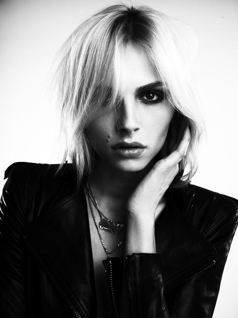
Theme I have chosen for my BW+1 photography series is "Consumerism" but rather than using the general idea of consumerism - which is shopping - I wanted to look at consumerism as something that consumes someone - something that consumes your thoughts and feelings etc.
Artistic Question Uno:  How can I express the theme Black and White + One through photo-based artwork?
  • To represent the theme of Black and White + One through my idea of Consumerism is the idea of black and white being the surface of a person i.e. what one can see at a glance. For the "+ one" I wanted to represent that by having their makeup done in a way to represent the "consuming aspect" and/or photoshop overtop  of the person and have that represent what is consuming you, it would be like adding color to the black and white to create more depth - so going past the surface. (for examples of how the makeup would work is reference two and three)
Artistic Question Dos: How can I explore using the medium of photography in a way that stretches my current knowledge and understanding AND suits my interpretation of the theme?
  • To stretch my knowledge in the medium of photography I will be using a mix of fashion photography - which is defined by having the subject's style (clothing, makeup etc.) emphasized as well as the idea of using a non-realistic setting for it rather than casual surroundings, also it requires a controlled lighting situation. I will also be using some elements from portrait photography - mostly the technique of butterfly lighting. (reference one for the style)


Independant Project - TTC


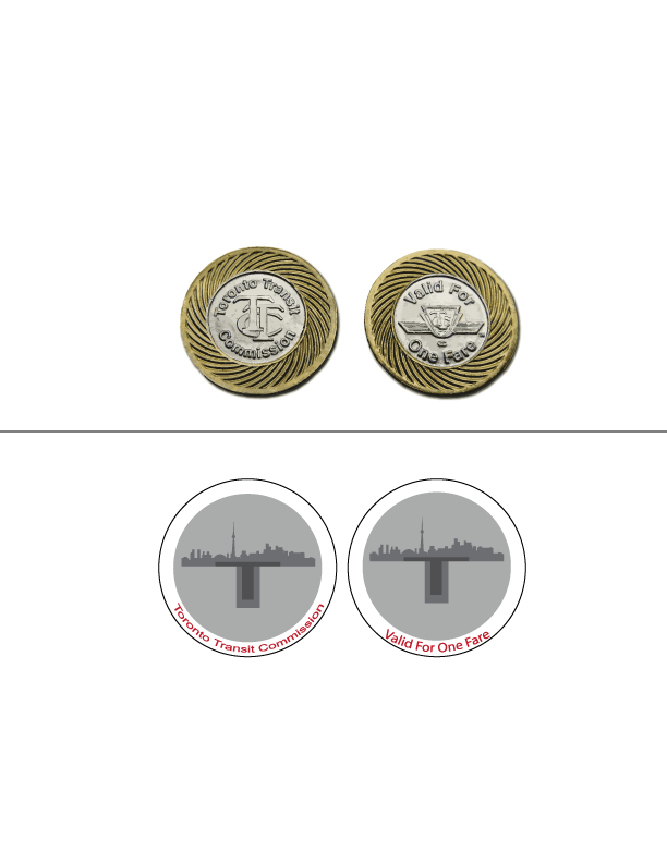
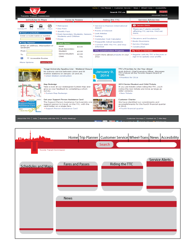
Concept was to take the boring ol' TTC and make it a modern, cohesive piece. I created these images using Illustrator, I did this because in Illustrator I can change the sizes to a multitude of sizes and I can also make clean and precise lines. Problems and issues I had for this was really just trying to decide, when it came to the actual making of the works I had no issue as I am good with working in Illustrator - better be after 4 years - so all the problems that occurred while doing this work was just deciding on the idea and sticking to it, I went through a lot of indecisiveness before actually picking out the TTC idea, also I had some issues choosing what to remake from the TTC.
Inspiration for these project came from older installments of TTC designs that I took and made a modern day twist on, I took a lot of opinions people had of the TTC as well as my own opinions and likes.  I'm personally satisfied with the way this turned out, I made the TTC brand more modern and a lot more cohesive of a project.


Independent Project Proposal A/B

Proposal A:
for my assignment I want to do a body of works - digital paintings - about the exploration the subconscious of dreams. Dreams are a big part of psychology and I want to  give a visual to the dreams people have. I'm very interested in this topic because of my interest in psychology as well as the supernatural/imagination, these two things collide in the subconscious of dreams. So I  wanted to try and make a mind map of ones subconscious, it would be like a landscape with the dreamer in focus.
"Dreams are disguised fulfillments of repressed wishes." - Sigmund Freud
Other ideas I had. 
  •  phobias 
  •  Love 
  •  Design Ideas: Cafe/TTC
Proposal B:
1. For my assignment I'll be doing the works in photoshop CS6 and use the tablet, after using the tablet and photoshop for a long time I have a good handle on how to use it. With photoshop I will mostly be playing with the clipping masks, masks and layering of the project, when it comes with what i need to learn however the only thing I need to focus on is making the full art piece in photoshop. I will be showing this piece on my blog and my art tumblr.
2. The concept of my desired works is to show a representation of dreams, focusing in on the idea that dreams are repressed wishes. So for my art pieces I want to represent wishes of a person in almost like a clutter scenery. I will be using different objects - like an oscar to represent a failed acting career - to show the wishes. I'm trying to show the ambitions of people and failures, just the trials and dreams we have as humans - an analyzation of human psyche.
3. Trying to pull in a bunch of different objects and make the picture cohesive will be difficult as well as trying to perfect my style of digital painting. Working to communicate my idea successfully I will have to run through many thumbnails to get a proper idea to things cohesive.
4. By keeping things away from the center and having everything off kilter I plan to almost make it seem like you are walking into this dream scene.
5. Inspired by alicexz's work (http://alicexz.deviantart.com/gallery/?offset=24) and several books I found within the library about dreams. 
6.   2-3 days on thumbnails for both pieces, color treating/scanning 1 day, line art of first work 1 day, base 4 days, shading 4 days, filtering and clean up 2 days. - repeats (doesn't account for other class time)

  • Links: http://psychology.about.com/od/statesofconsciousness/p/dream-theories.html / http://psychology.about.com/od/statesofconsciousness/tp/facts-about-dreams.htm / 


Artistic Inspiration: Vixx

Not exactly an artist but hey, they are inspirational! I'm inspired by their concepts and lyric choices. Their music inspires me to do art, as well them themselves. I enjoy watching their interesting videos, which have been very intricate and special. The one above is their most recent video "Voodoo Doll" which is mind blowing, looking at this at a cinematic viewpoint rather than one of a fan; the shots are really nice, coloring of the scenes help translate the feeling of oppression of the girl etc. Viewing this video inspires some art pieces from me to do of the video, hence why I put it. Also the connection of this video to the others - I will link below - inspires/shows me a way to connect one story through videos/pieces that are all too different, as these videos all connect to each other.

Amazing Inside - Statment


For the design of the poster I wanted to give this group feeling also use a common image of our school which is circle outside of LCI so I took special (and regular) courses and represented them inside the circles using tools used inside the class - also to represent our love of football I showed it as a message for all sports. By having it branch out from the circle I wanted to give it a feeling of rising above, to represent excellence. I wanted to use bright blues to give it a pop as well as having a orange to contrast, using a light grey to represent our school colors as well as the using orange because it's our amazing inside color. I have darker variants of blue and grey for the background to make the foreground pop more.
I am very pleased the turnout of my designs especially for the flyers. I wish I could've done something more interesting with the background of the poster but I was unable to think of anything. Also I would've made the colors of the technical subjects images more bright.
With the creation of this poster I had the most problems with the curve of the words along the curve of the circle, also with finding proper colors to match up with each other. 

Brand Identity


The name of my company is Roxana Designs, the nature of my company is a graphic design/advertisement company. I wanted to express a feeling of uniqueness by using the snowflakes - only one of a kind - as well have this feeling of balance and stability - the snowflake can be seen as two overlapping triangles, and triangles are very stable. Also the design is very precise with clean lines and proper repetition. 

I choose very organic shapes to make up my snowflakes to give it a less hard and mechanical feelings. I used the negative space in the snowflake to help give it interesting feeling and to keep it from looking too heavy, by having all the pieces disconnected it makes it look more free and loose. The light/dark purple gradient was chosen because light purple represents elegance and it's inviting whereas the dark purple gives a feeling of seriousness and power as dark purple was the color of many royals and used for villains in pop culture because it radiates power.
Starting out with the logos I went through and scraped many ideas, I sketched out a few ideas basing off of my name, initials and things I had interest as well as things I wanted to convey using this logo. After the sketching process I scanned it in and tried out the designs, finding it just didn't click. So I researched some more logos and tried a few more ideas using a city scape and some paint strokes, but this as well didn't work for me. Going through the process again, I ended up using one of my original ideas and using some references from the internet to come up with the design.
Technically I made this logo using the pen tool then going to flat color only to find issues with the look of it, using a gradient I was able to revamp the snowflake to give it a more 3D look. I had the hardest look placing the text properly with the snowflake to be visually appealing.
I intend to modify the logo by changing the the font of the text as long as the alignment. Also if possible I wanted to change the name of my company to something with a better flow and also once I finalize what I want to do with my career I want to adjust the name. Otherwise I am very satisfied with the results of my logo.
For the two other parts of promotion I want to make a necklace as well as sketch/lined book with my symbol on the cover and fitting my design. The animated logo I'm doing the snowflake fall into the middle and my name come out from the middle.